In this article:
Overview
When building metrics or statements in Reach Reporting, you have a full set of controls for managing rows and columns. Understanding these tools will help you customize exactly what data is displayed and how it is organized.
Working with Rows
Toolbar Icons Above the First Column
At the top of the first column in the builder, you will find several key icons:
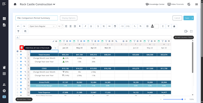
Eye Icon – This is used to hide individual rows from the final published metric or statement. Each row has its own eye icon, giving you granular control over what is visible to viewers. A white eye denotes a hidden row, and a blue eye denotes a visible row.
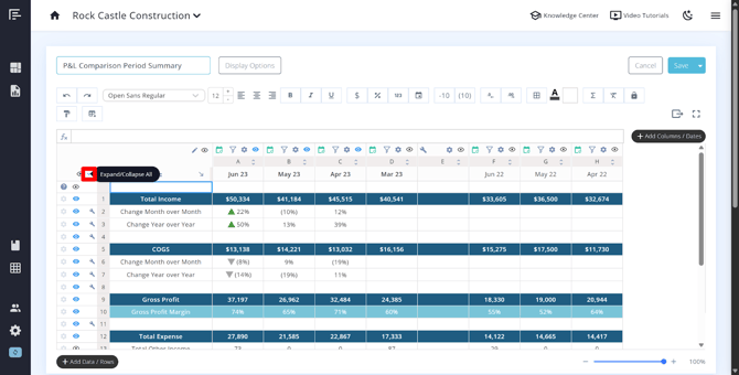
Expand/Collapse Groups Button – This icon collapses or expands all account groups at once. You can also find this icon on individual parent account rows if you want to expand or collapse only specific account groups.
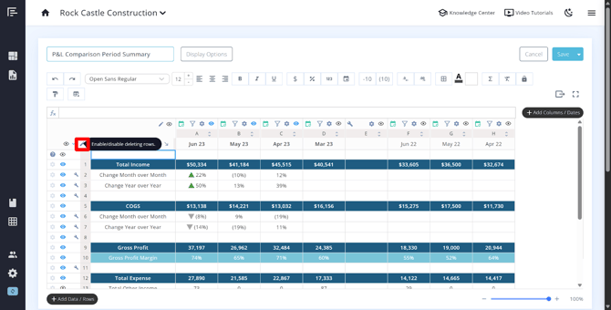
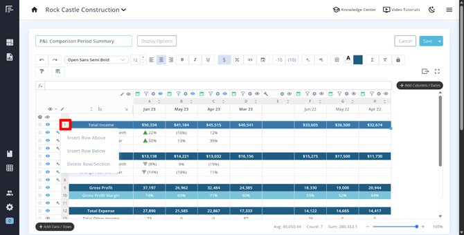
Pencil Icon – Click this to enter row selection mode, where you can select multiple rows and delete them using the trash can icon that appears.
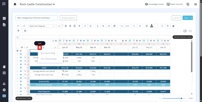
Sort Icon – Located near the arrange rows icon, this allows you to sort all rows in ascending or descending order. Each column also has its own sort button, so you can sort the data by a specific column in ascending or descending order.
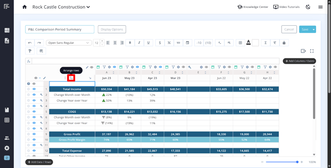
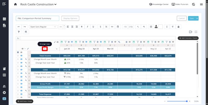
Arrange Rows Icon – Click and drag rows into your preferred order using this icon.
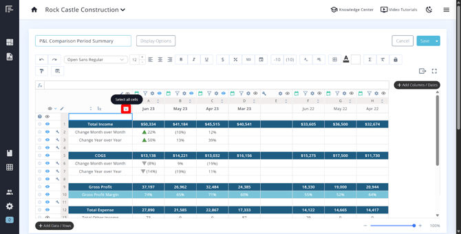
Arrow Icon (Select All) – Also located near the arrange rows icon, clicking this selects all rows and columns in the editor at once, making it easy to apply bulk formatting changes.
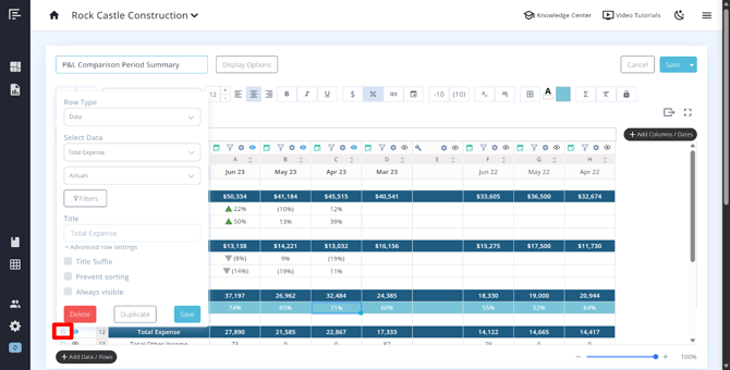
Individual Row Settings
Each row has a gear icon that opens its individual settings. The options available will vary depending on the row type, but commonly include:
- Data type – Change how the data in that row is calculated or displayed.
- Class or department filter – Filter the row to show data for a specific class, department, or location.
- Title – Rename the row label.
- Advanced settings – Enable options such as title suffixes, prevent sorting, or set a row to always be visible regardless of other display settings.
Adding New Rows
To add rows to your table, click the Add Row button. From here you can:
- Add custom rows (for formulas, labels, or manually entered data)
- Add full statements
- Open the data picker to select additional accounts or data sources
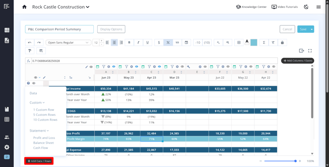
You can also right-click a row number to quickly insert a custom row above or below that position.
Tip: If you add a row using the Add Row button, it will default to the bottom of the metric or statement. Use the arrange rows icon (found above the first column) to click and drag rows into your preferred order.
Working with Columns
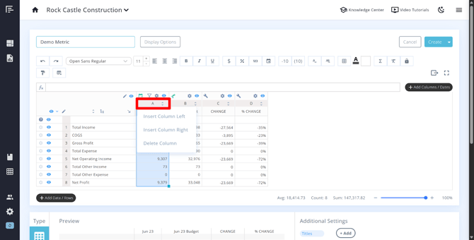
Columns share many of the same controls as rows — including a pencil icon to delete, an eye icon to hide, and the ability to right-click a column letter to insert a custom column.
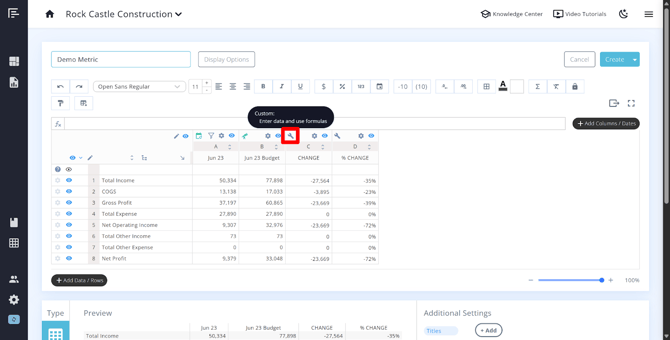
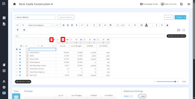
Column Type Icons
Above each column, you may see one of three icons that indicate what type of data the column is pulling in:
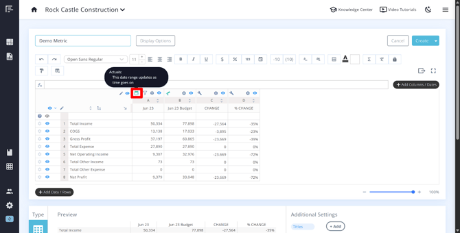
Calendar icon – This column is pulling in actual data from your connected bookkeeping software or a data sheet.
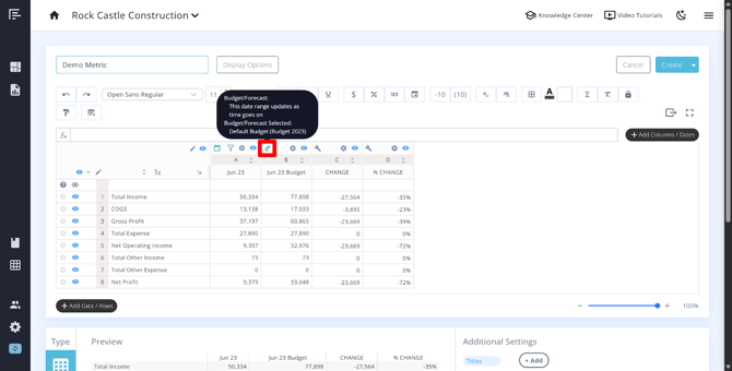
Telescope icon – This column is pulling in budget or forecast data.
Wrench icon – This column contains custom or manually entered data.
Green vs. Grey Icons
The color of the calendar or telescope icon tells you whether live dates are active for that column:
- Green – Live dates are turned on. The column will automatically roll forward as your book month changes, always pulling the most current data.
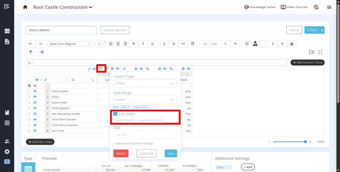
- Grey – Live dates are turned off. The column is pinned to a fixed date range and will not move forward over time.
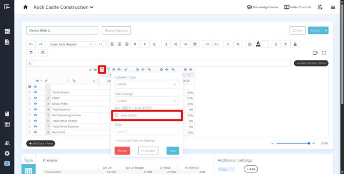
Note: Columns with live dates turned off are useful when you want to preserve a historical snapshot of data. However, be aware that those columns will not update as new data is synced.
Funnel Icon (Class/Department Filter)
If a funnel icon appears above a column, you can use it to filter that column's data by a specific class, department, or location — depending on your integration and how your bookkeeping is set up. When a filter is applied, a subheader will appear beneath the column header showing the active filter.
For more information, see Classes, Departments, and Locations.
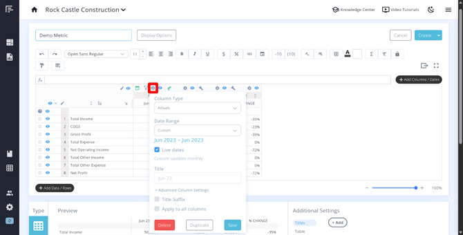
Column Settings (Gear Icon)
Clicking the gear icon above a column opens its individual settings. Here you can:
- Change the data type – Switch between actuals, custom, budget/forecast, actuals vs budget/forecast (relative to book month), or Google/Excel (non-date columns) .
- Adjust the date range – Set the specific time period the column covers. For a full list of available date ranges and what each one means, see Explaining All the Date Ranges in Reach Reporting.
- Toggle live dates on or off – Control whether the column updates automatically with your book month.
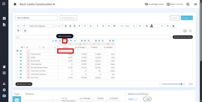
- Override the title – The column date range will automatically populate as the header for columns that have Live Dates turned on. You can override the title to customize the column header text in the Title setting.
- Advanced settings – Add a title suffix and optionally apply that suffix to all columns at once.
Moving Columns
To reorder columns, hover over the column letter until you see a crosshair icon, then click and drag the column to its new position. Alternatively, you can click the pencil icon near the columns to make the crosshair icon visible. Note that only one column can be moved at a time.
Adding New Columns
Click the Add Columns button on the right side of the builder. From here, you can choose from the following column types:
- Actuals – Pulls live data from your connected bookkeeping software.
- Budget – Pulls in budget data.
- Actuals vs. Budget/Forecast – Displays actuals until the book month, and budget/forecast month going forward.
- Non-date data from Google/Excel – Brings in data from a connected Google Sheet or Excel Sheet that is not date-based.
- Custom column – A manually entered or formula-based column.
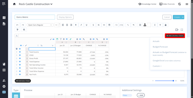
Tip: You can also right-click any column letter to insert a new column to the left or right of that position.
Column Width
At this time, there is no way to manually adjust the width of individual columns. Column width is determined automatically based on the number of characters in a cell, the font size, and the overall sizing of the metric on the page. Statements will adjust their column widths according to the page layout (portrait or landscape).
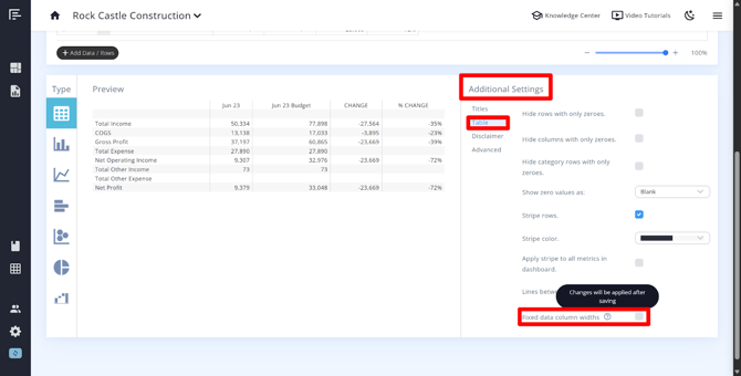
There is one setting that affects column width behavior: Fixed Column Data Widths. When enabled, this setting makes all columns the same width. This means that columns containing more text will wrap within the cell rather than extending beyond it. You can find this setting within the metric or statement builder in the Additional Settings > Table.
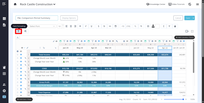
Paint Formatting
The paintbrush icon in the builder allows you to copy the formatting of a row, column, or cell and apply it to another. To use it:
- Click or highlight the row, column, or cell whose formatting you want to copy.
- Click the paintbrush icon in the toolbar.
- Click the row, column, or cell you want to apply the formatting to.
Tips and Best Practices
- Use the eye icon strategically to keep rows and columns in your builder for reference while hiding them from the client-facing version of the report.
- If you need a column that shows a comparison to a prior period (for example, last year's actuals), use the Actuals column type with the appropriate date range and enable the Comparison Period option during setup.
- If you need a column that shows a comparison between Actuals and Budget, use the Budget/Forecast column type with the appropriate date range and enable the Include Actuals option during setup.
- The title suffix in the advanced settings of both rows and columns is helpful for adding labels like "Actual," "Budget," or "Variance" automatically, especially when using the Apply to All Columns option to keep your headers consistent.
- Toggling live dates off is useful for historical reporting where you want the data to remain fixed regardless of book month changes.
To filter an entire metric or statement by class or department at the report level (rather than per column), use the funnel icon on the top right of the statement or metric page. See Classes, Departments, and Locations for more details.
Go to the Reach Reporting app>
ARE YOU NOT CURRENTLY USING REACH REPORTING?
learn more at reachreporting.com
We are dedicated to helping you.
- Need Additional Help?
Your success is important to us.
Whether you're working as a CFO of a business or part of an accounting firm, Reach Reporting is here to improve your working knowledge of reporting and provide service tips and skills to ensure you're at the top of your game.
We make sure that you have access to staff members who are best suited to help you. We work together to resolve issues and create memorable moments that empower you to enhance your reporting skills.
We are here to listen to you. We understand that using new technology can be frustrating, so we can answer questions or jump on a quick Zoom call. Our entire staff has an in-depth knowledge of Reach Reporting and can quickly direct you to best practices to improve your reporting.
We are focused on providing solutions that save you time and increase your value. We continue to improve each day and look forward to visiting with you. Your communication with us is vital and appreciated.
Please feel free to chat with us by clicking the help chat bubble in the lower right-hand corner of this page.
Reach out to your Reach Reporting Rep and schedule a Zoom meeting by clicking the meeting link in their email signature.
Or schedule to join our ongoing webinars.
Reach Reporting is dedicated to helping provide a knowledge base that is easy to understand and informative. If you still have questions that have not been answered, please let us know by emailing support@reachreporting.com, chatting with our support team, or calling us at (877) 467-7637. We are here to ensure that you have a positive experience with Reach Reporting, as we want to continue to be the reporting solution you trust.
Need more access to Reach Reporting Resources?
Reach Reporting has a wealth of knowledge and a robust online community to support you as you create reports that provide powerful insight. Please look into the following resources.
Reach Reporting Blog: We add blogs to our site every month to give you great information in a fun and friendly manner.
Case Studies: We interview one company per month to help our clients highlight how they are using Reach Reporting and how it is improving their services and firm offerings. These case studies are invaluable to our community.
Knowledge Center: From simple to complicated, we provide step-by-step guidance to utilize every aspect of Reach Reporting in our robust knowledge center.
Video Tutorials: We know watching is sometimes easier than reading, which is why all of our tutorials are video-based in the video tutorial section of Reach Reporting and Youtube.
Social Networks: Join us on FaceBook, LinkedIn, Youtube, and Twitter.
Monthly Newsletter: Go to the footer of reachreporting.com and sign up to receive the Reach Reporting newsletters delivered directly to your inbox. Our newsletters cover tips and tricks, current events in accounting, strategies to improve your advisory services, and much more.
We look forward to helping you build insightful reports,
The Reach Reporting Team.